Skyline Railing
Creative Direction, Art Direction, Design, Packaging, Photography
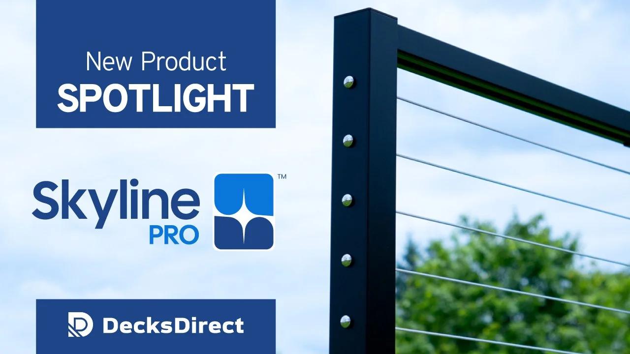
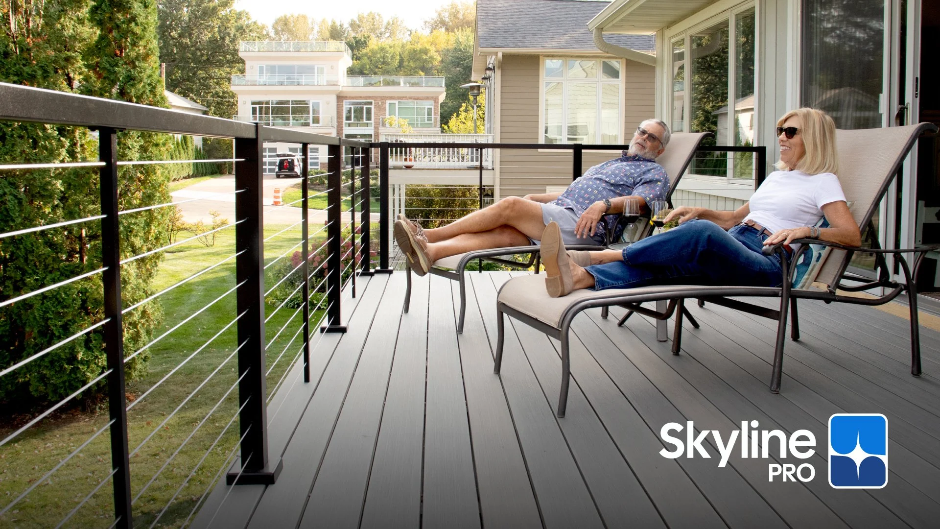
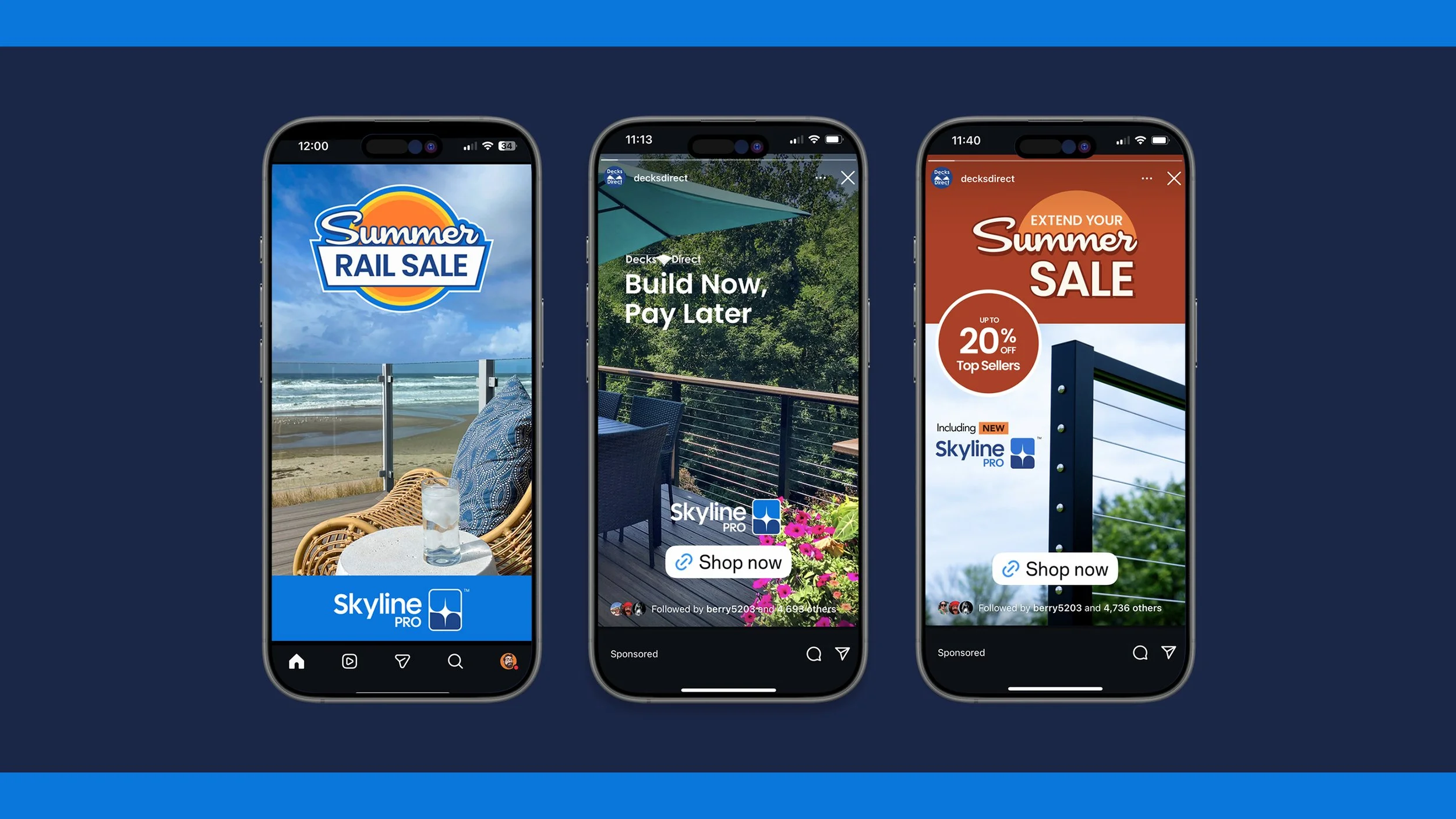
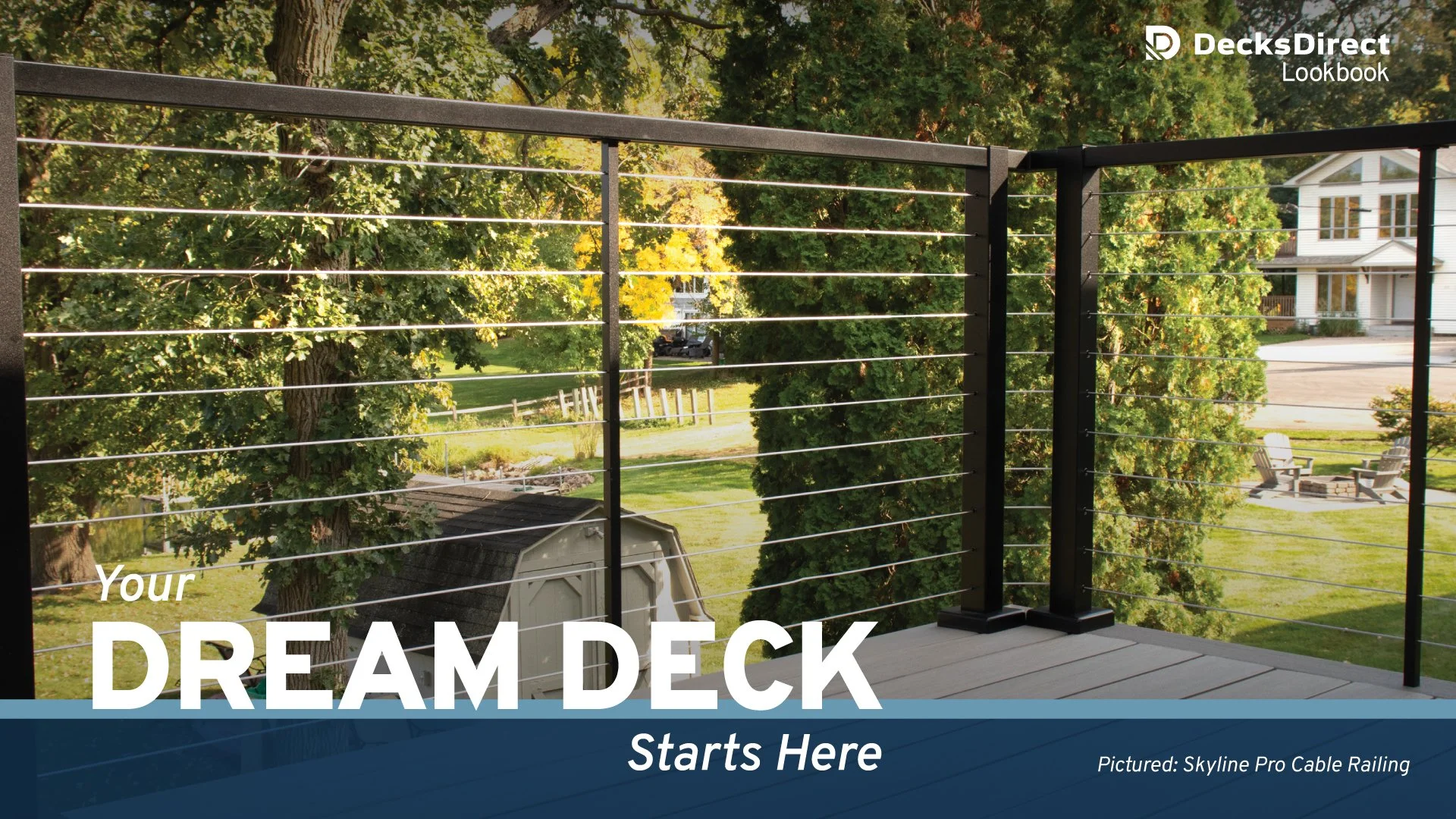
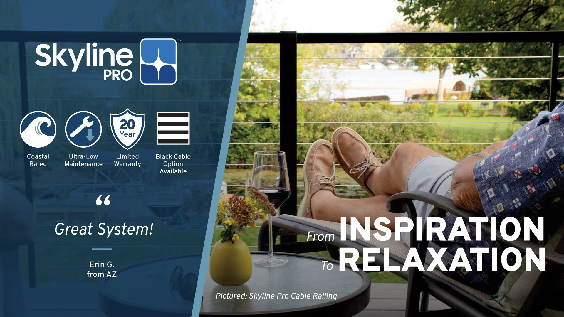
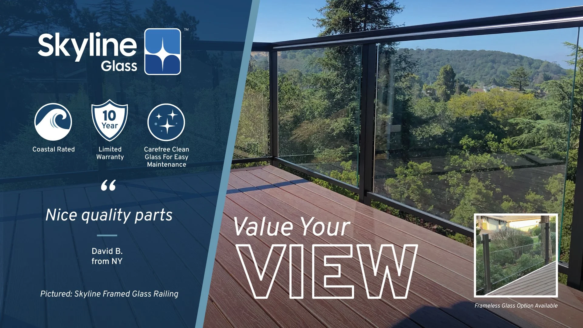
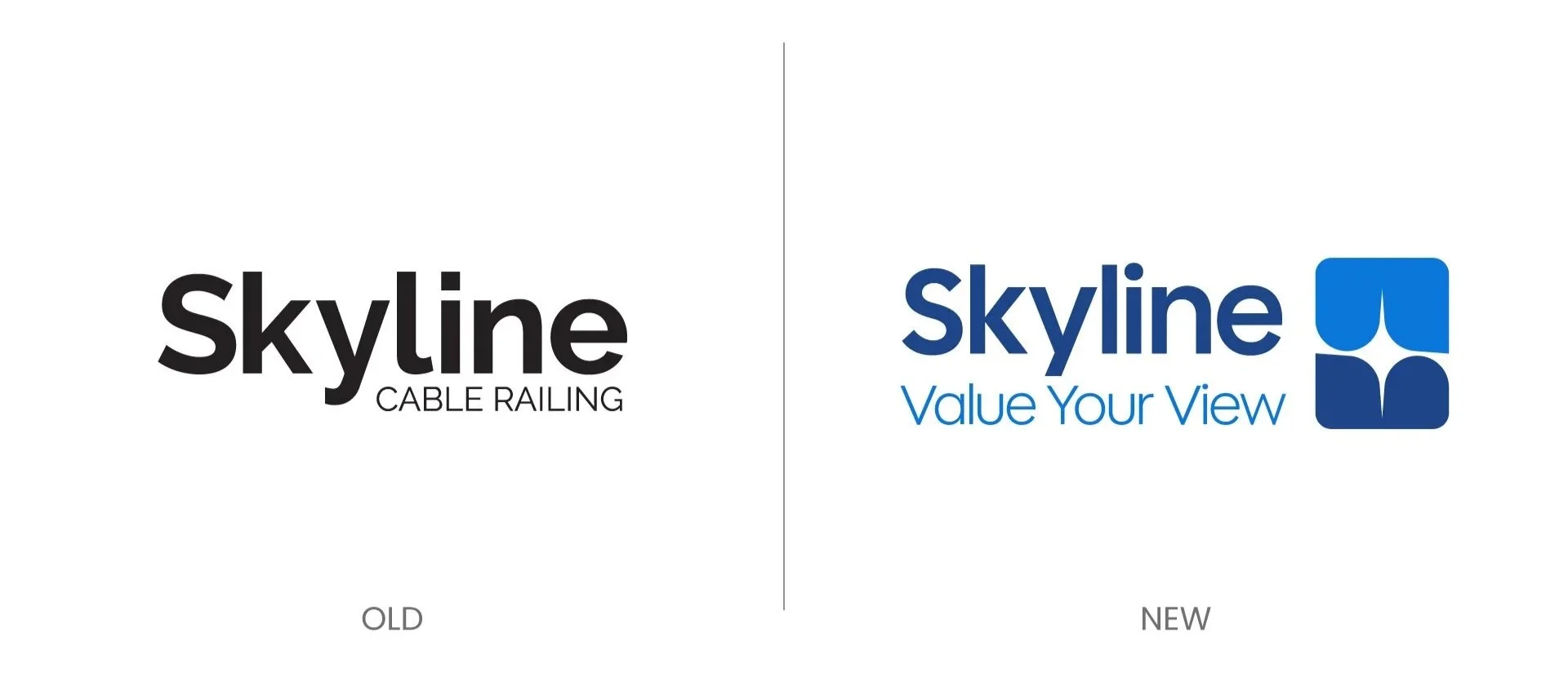
Skyline Railing, the flagship in-house railing brand, is a luxury cable and glass railing brand sold exclusively by DecksDirect. With the introduction of Skyline Pro, an even easier and faster to install premium cable railing system than the previous iteration of Skyline, a brand overhaul was needed to both separate the different lines of railing and to reinvigorate the brand as a whole, which previously never had an official logo or tagline.
What Was Needed
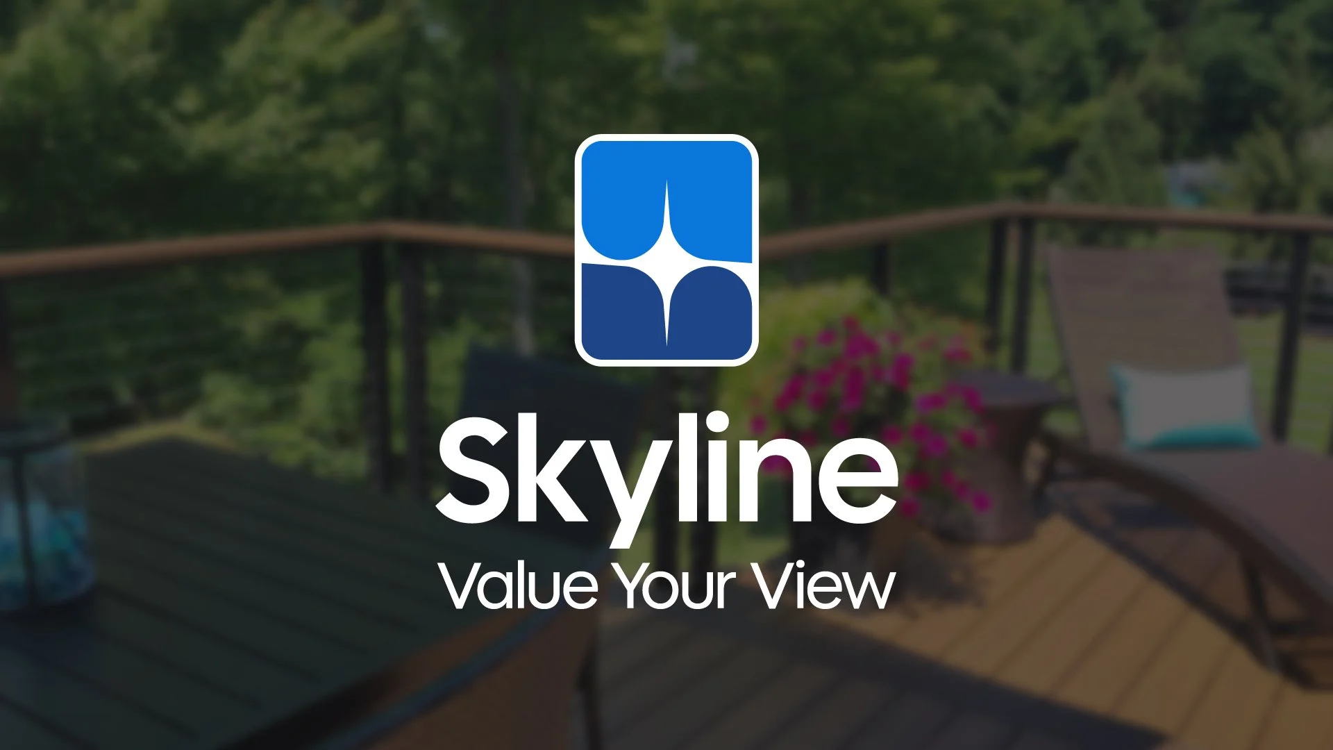
In time for the launch of the new Skyline Pro, I created a logo that is simple, iconic, instantly recognizable and scalable . The new logo visually represents the qualities associated with the Skyline brand— wide, unobstructed views, modern, sophisticated looks with clean lines and premium quality at a cost-effective price.
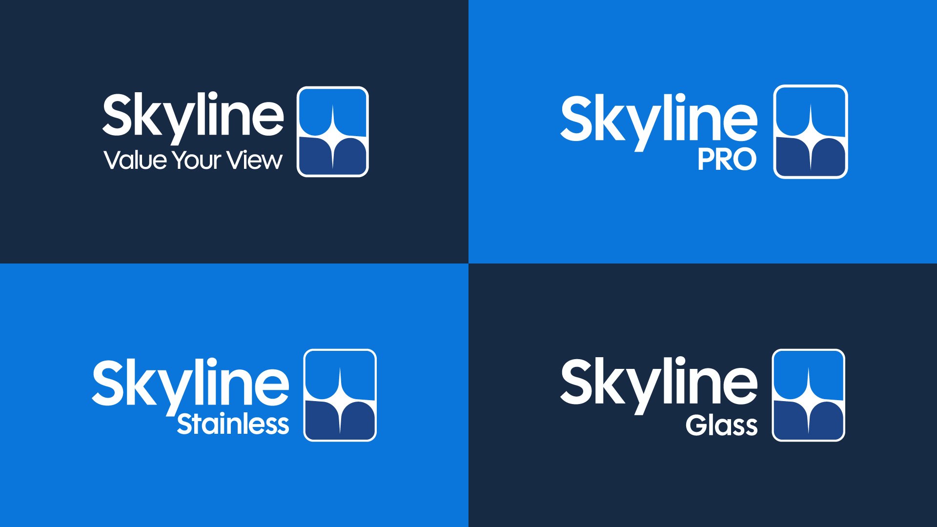
The new color palette pays homage to the old DecksDirect brand identity by utilizing the color palette of dark blue, electric blue and white. On top of that, I created and incorporated an abstract badge/graphic to accompany the wordmark of “Skyline” that visually represented the qualities of the Skyline brand previously discussed.
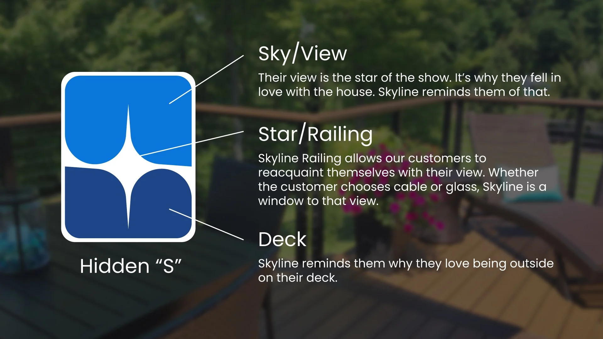
More than a Star
I crafted a simple, abstract and iconic logo that tells the story we wanted conveyed about the Skyline Railing enhancing your view.
The electric blue represents the sky/view, the dark blue represents their deck and the star represents the Skyline railing.
I added a little asymmetry with the design so I curved the corners of the blue to create a hidden abstract “S.”